
Typography as an Artistic Device
Somerset Digital Studio Bonus Training
 Welcome! If you’re here, you must have read my article on creative typography in the latest edition of Somerset Digital Studio Magazine.
Here on this page I’m going to share with you over 2 hours of additional video training on working with typography within Photoshop and Adobe Elements so you can begin employing this powerful creative tool in your own compositions.
Enjoy!
– Sebastian
Introductory Video To Get You Started . . .
The first of the videos below comes from my original Photoshop Artistry course, which will definitely get you started out with all the basics you’re going to want at your command …
A Few More Notes on the Character Palette:
If you’re not using the Character Palette when working with your typography, you’re leaving a great many valuable tools on the table untouched. You need to be familiar with what you can use these controls to do when manipulating your text. I’ve created a list here of the six components in this palette you’re going to want to know about, along with a few words on each …

A: Font Name — this is of course critical, although you will likely set this up in your top tool bar rather than here. Same with the color-picker. You have it in both places.
B: Font Style — some fonts will have more, others fewer options here, and again you’ll likely set this up in the top tool bar, but it’s nice having it here too. Making your text bold or italic with a font style is far preferable to employing one of the “faux styles,” since here you’re actually employing a perfect variation of the font as created by the designer.
C: Font Size — remember that either here or in the top tool bar you can click and drag above the “tT” to the left or right to dynamically change font size.
X: Font Spacing — I use this all the time to adjust how tightly packed the letters are, which is especially handy when you want to make a line of text line up precisely with another line of text above or below it, or line up within a specific area or along a specific other element in your composition. Keep in mind that you can type in any number here; you’re not limited to the increments that come up in the drop-down menu.
Y: Font Stretching — Stretching your text vertically or horizontally can be employed creatively here and there. Just remember that if you do so, those settings will remain until you go in and change them! (Also: keep in mind that it’s almost always easier and more visually intuitive to “stretch” your type using the Free Transform box (Cmd/Ctrl+T), as with any other element you want to stretch, smoosh, or scale.)
Z: Faux Styles and Variants — I rarely use the “Faux Fonts” or mess around much with the specialized font settings, but it’s nice knowing they’re there if you want to try for a typographical nuance that otherwise isn’t available in the main font style menu. But again, remember that if you toggle any of these on, they stay on. So if you use that font again in your composition, you may want to go in and toggle it off if you don’t want the same effects carried over to the new text.
Some Additional Training on Loading Custom Fonts . . .
Picking just the right font goes a long way toward ensuring that your typography amplifies your artwork in a creative yet relevant way. And there are just so many wonderful fonts out there, a vast number of them completely free. You’re going to want to tap into that treasure trove as you begin exploring the use of creative typography in your work.
The above video covers handling fonts on a Mac, but I’ll include some notes down below on working with fonts on a PC.
Important Tips on Adding New Fonts To Photoshop or PSE (Elements)
1.) Many font packages you download from the Internet may be contained in compressed .zip files to reduce file size and make downloading faster. If you have downloaded a font that is saved in zipped folder (a .zip file), you can generally “unzip” it by simply double-clicking the icon and following the instructions on the screen. (You might also try right-clicking it and choosing “Extract” if that’s listed.)
2.) Remember, if you don’t spot the fonts in your font menu, you might need to restart your Photoshop program for it to see the new fonts as available.
3.) Remember, too, that the more fonts you have, the slower Photoshop will load. So it might benefit you to remove some of the fonts you don’t see yourself ever using. (Just disable them in the Font Book on a Mac — which comes up whenever you install a new font. Or on a PC, simply move them out of the Font folder and into some other folder you can keep elsewhere on your computer for storing inactive fonts.)
4.) Finally, keep in mind that when you install new fonts, each font will only work with the computer you’ve installed it on. If you edit your images on multiple computers, or if you share your documents or image files with other people, the new fonts you’ve installed on your computer might not be displayed the same way on the other computer. Text that is formatted in a font that is not installed on a computer will be displayed in either Times New Roman or the default font. So if you want others to be able to use the fonts in your image (for instance a printer who has requested the layered PSD file), you will likely need to send along a zipped folder containing the special fonts you’ve used in your piece. (This wouldn’t apply if you flattened your image or saved it as a .jpg image file, of course.)
INSTALLING FONTS ON PCS w/ WINDOWS
Installing Fonts on PCs running Windows 7 … Simply copy the new font from its folder to the Font Directory, located at: C:\Windows\Fonts
Just go to your Start Menu, choose My Computer, and then double-click your C drive … Then look for the Windows folder, and inside of that your Fonts folder. You can copy and paste your new fonts in there, or drag and drop it into that folder.
Alternatively, you can open the folder containing the new font, right-click on the font file you wish to install and select Open. In the resulting Font Preview screen, click on the Install button at the top left of the window.
Installing Fonts on PCs running Windows Vista … Simply right-click on the font file you wish to install and choose “Install” from the menu. Or you can select Open, and in the resulting Font Preview screen, click on the Install button at the top left of the window.
Another way to do this is to click the Start button, click Control Panel, click Appearance and Personalization, and then click Fonts. Once there, go to the File menu up top, then click Install New Font. (If you don’t see the File menu, press ALT.) In the Add Fonts dialog box, under Drives, click the drive that contains the font you want to install. Under Folders, double-click the folder containing the fonts you wish to add. Under List of Fonts, click the font that you want to add, then click Install.
Installing Fonts on PCs running Windows XP … Click the Start button, click Control Panel, click Appearance and Themes … Now, under “See Also” go ahead and click “Fonts.” In the File menu up top, choose Install New Font. Select the drive and folder to go find it. Click it and select OK.
And for PC-users, how about a free font viewer for PCs (Windows)? Here’s a simple (free) font viewer for you folks out there using Windows:
https://www.ampsoft.net/utilities/FontViewer.php
Now One More Training Video on Getting CREATIVE with Typography …
With the fundamentals out of the way, now we can get creative. Here you’ll get to enjoy another video from my Photoshop Artistry course …
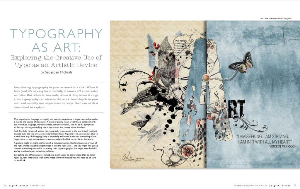
In the above video I talk about some of the fundamental ideas you’ll want to consider and explore in your efforts to make creative use of typography in your work. The most important rule, remember, is to always strive to ensure your typography functions as a creative enhancement to the work, never as something that feels intrusive, unsightly, or (worst of all) boring.
Typography should in itself be artistically rendered if it’s to be included at all. (It should be artistic in and of itself. It should never just seem like something typed onto the piece as if at random, or as if having been given no real thought or consideration.) Put simply, if it’s not making the piece more interesting, then it just doesn’t belong there.
Becoming adept at including typography in your compositions as an artistic device takes practice — and a lot of trial and error. Expect to experiment (a lot) with font choices, font sizes, placement and orientation of the type you include, and any artistic embellishments you bring into the mix to make the typography more interesting and more suited to the overall piece. But if you can master this skill set, it will not only make creating art more fun, but also open up a great many commercial opportunities for your work.
Here Are Some More Ideas You Should Go On To Explore . . .
* Font Selection — critical! Try to stick with only a few in any given piece, but make sure they’re perfect for it./p>
* Font Size (and Shape) — experiment with varying your font sizes, either from word to word, or within the letters of a single word. And a tip on font size: keep in mind that you can also use Cmd/Ctrl + T (Transform) and then resize your type as you would any other element. If you hold down Shift while you drag a corner handle it will maintain proportions; otherwise dragging handles will distort the text horizontally or vertically, which might be exactly what you want to try. You can even right-click inside of the Transform box and choose Distort, Warp, or Perspective, giving you entirely different capabilities when you drag the various handles. The possibilities are endless.
* Font Color (or Style) — very important consideration, obviously. Give it some thought. Most often white and black seem best … but maybe not in a particular context. You can even “color” your text by clipping a texture inside of it (place the texture above it in the layer mask, hover between the layers off to the right side, and hold down Alt / Opt while clicking to clip the texture inside of the type below it. You can also add an Adjustment Layer to the type, or assign it a Layer Style (f/x) and a color overlay. Try out various techniques and styles and see what works and what doesn’t. (Drop shadows, for instance, often help text. But not always. And sometimes they work best when only certain words have them and others do not. Experiment and see.) And something else about color: keep in mind that black text against white is normal, white text against black “reverse.” And sometimes setting some text normal, and other text in “reverse” can make for a cool effect. Just depends on what you put it up against and the color you assign it.
* Font Orientation — use Cmd/Ctrl + T (Transform) to rotate some of your type sideways, or set it at an angle. Try different orientations against one another or in combinations. Try employing varieties of curved text, only have a care that it actually looks good and doesn’t just come off as a trick for its own sake. And also try stacking some of your text as well. Everything needn’t be perfect. Get creative!
Start with these and see what you can create!
– Sebastian